A Gmail first Strategy for Responsive Emails
Every email project is different. But when I create responsive emails that need to work in the Gmail App too, I fall back to the same strategy over and over.
I. Calculate your grid
I don't design my clients' emails. But I will try to fit a grid if possible, thus improving the design. This involves lots of math, which I do scribbling on paper.
While planning for this article, I realized how repetitive that is. So I built a prototype tool yesterday afternoon to play with grids.
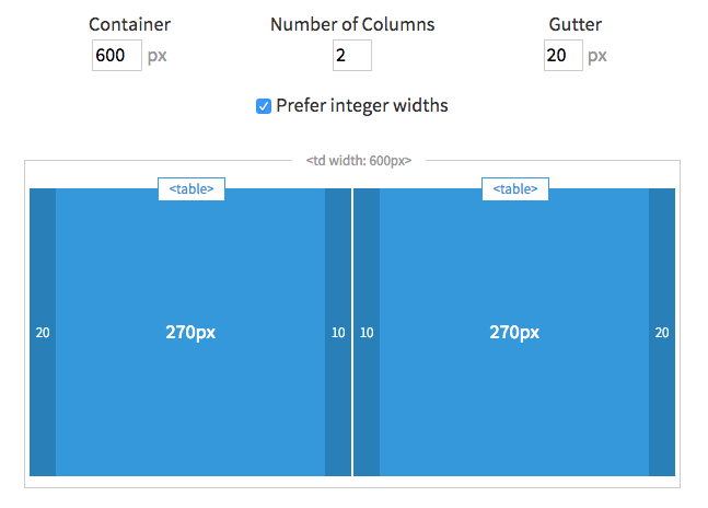
Use <table>s not <td>s for Columns
Use tables with align attributes for columns and a wrapper table for Outlook. See the Antwort wiki for a further explanation on how this works.
II. Three Levels of CSS
I use the term "level" to refer to the CSS priorities. If you have a better idea, let me know.
- Level 1 CSS Prioritize mobile Gmail and use (smaller) padding for gutters. This CSS is inlined.
- Level 2 CSS
Apply (large) desktop gutters in included
<style>tags. This CSS requires!important. - Level 3 CSS
Switch back to smaller gutters with media queries. This CSS requires
!importantand must be inside a media query to override previous level.
Yes, we are defining our gutters three times. Not very DRY. But as someone with previous design background, I think this design detail matters.
III. Example Template and Code Walkthrough
To illustrate this, I quickly threw together a simple email template.
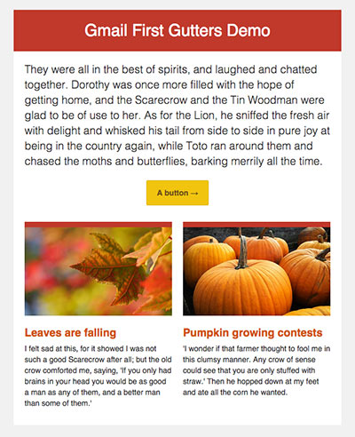
The top section works like a single column and applying gutters here is straightforward.
Think mobile-first and choose a smaller gutter for phones, so we can maximize screen real estate for content. Let's use 20px gutters for desktops and halve it to 10px for mobile.
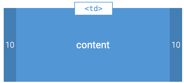
Each column has the following basic layout:
<table width="100%" align="left" style="width:100%; max-width: 300px">
  <tr>
  <td style="padding-left:10px; padding-right:10px;">…</td>
  </tr>
</table>
Because we use align="left" and include a max-width:300px our tables will automatically float next to each other at 600px and above. We'll add some help for Outlook a little bit later.
Because Gmail strips <style> tags, this means that our "grid" is off on desktop with:
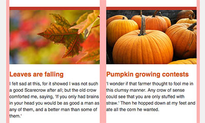
Imperfect design. But it's not broken and a compromise my clients and I have been willing to make in order to support mobile Android. By the way: 50% of emails are opened on mobile1.
Ideally we want a two column grid with the following layout on desktops (or larger screens):
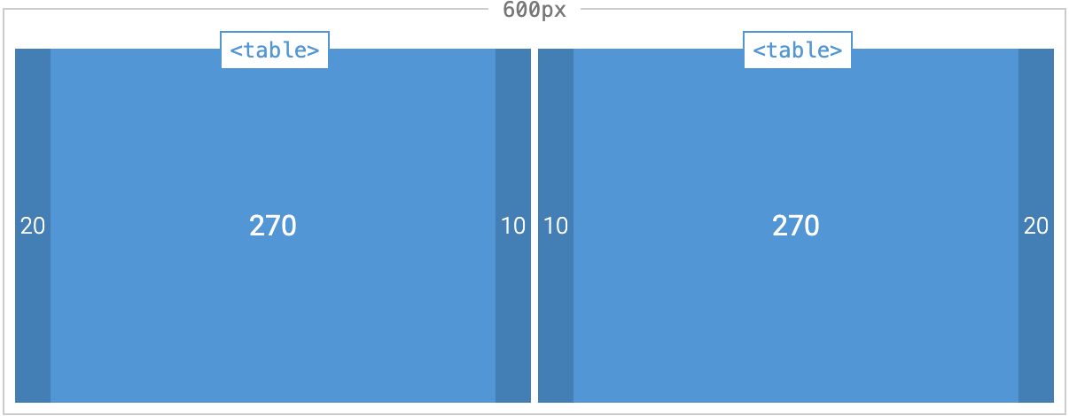
The tricky part here is getting 20 pixels in the middle, which requires 10 pixel gutters in two separate tables. For regular developers, this is straightforward. For email developers, I've got you covered.
Outlook Gotcha #1 - wrapper tables
Problem
Help! My columns are stacked, not floated.
Solution
Outlook does not support floats. So use extra wrapper tables to bullet proof your layout. Wrap these extra tables in if mso comments to make sure only Outlook sees them only. Otherwise you will lose your responsive layout for mobile devices.
<!--[if mso]><table><tr><td width="300"><![endif]-->

  <table>… Column 1 …</table>

<!--[if mso]></td><td width="300"><![endif]-->

  <table>… Column 2 …</table>

<!--[if mso]></td></tr></table><![endif]-->
Lazy? Use my email layout tool to generate basic skeleton including Outlook wrapper tables. And don't forget the valign="top".
Generate the Outlook wrapper table for me →
Outlook Gotcha #2 - nested selectors
To override the mobile gmail first gutters, we need to override the padding inside our <td>s.
Problem
Why is Outlook not applying our CSS overrides?
Assuming we have <table class="col">, you would assume, we could just use a .col td selector to perform our overrides.
Answer
Unfortunately Microsoft Outlook 2007/10/13 does not support nested selectors with class names2.
Because have different gutters in each column, we cannot just use a single selector. In my example template, I use:
.col-1-td {
  padding-left: 20px !important;
  padding-right: 10px !important;
}

.col-2-td {
  padding-left: 10px !important;
  padding-right: 20px !important;
}
Outlook Gotcha #3 - naming selectors
I recently completed an e-commerce email that had a complicated table with many columns and many rows. I referred to each column like so:
.n1for the first column.n2for the second column- etc.
Problem
But Outlook was not adjusting the gutters.
Answer
Use different (longer?) class names.
To debug a problem like this, I use background-color: red !important;. And so I saw that Outlook did not recognize the selector. Maybe the name is two short. I don't know.
In any case, I made them longer, for example, .l-name, .l-desc. This has the advantage that it is more descriptive, but the disadvantage of added characters and therefore added file size. When coding dynamically generated emails, a few characters can snowball into many kilobytes depending on how much dynamic data you have. This may cause your email to be cut off in gmail clients. The limits are ~102kb3 on web client and ~20kb4 in the gmail app.
IV. Back to Desktop (level two)
So now that we know about how to handle Outlook, we can include this CSS to use larger gutters on desktops:
.banner,
.intro {
  padding-left: $gutter !important;
  padding-right: $gutter !important;
}

.col-1-td {
  padding-left: $gutter !important;
  padding-right: $gutter/2 !important;
}

.col-2-td {
  padding-left: $gutter/2 !important;
  padding-right: $gutter !important;
}
where $gutter is 20px. I use variables whenever possible for consistency. This also makes changes easier and code more reusable.
V. Backtrack to Mobile (level three)
And finally, when you're ready to go back to a mobile layout with smaller gutters:
@media screen and (max-width: 599px) {
  .col {
    width: 100% !important;
    max-width: 100% !important;
  }

  .banner,
  .intro,
  .col td {
    padding-left: $gutter/2 !important;
    padding-right: $gutter/2 !important;
  }
}
Because only modern clients apply media queries, we can use our nested .col td selector here.
Note the 599px here is arbitrary. You could revert to single columns at a smaller break point. But recall your .cols have width: 100%; max-width: 300px, so they'll stack. You will have to adjust as needed.
Voila. You're done.
Where to put horizontal gutters?
I just also wanted to point out that there is a padding-bottom: 30px on the td.text so that when Gmail auto scales our email for mobile and stacks our columns, they do not sit directly on top of each other.
It's tempting to apply a padding-bottom to td.posts, which also saves us repeated code and added bytes. But then it wouldn't work in Gmail.
VI. Recap
- Use aligned tables for columns so our layout is responsive in the gmail app on Android too.
- Defined layout gutters three times, using a gmail first approach:
- Level 1 inlined CSS (gmail first)
- Level 2 included CSS overrides with
!important(desktop) - Level 3 included CSS overrides with
!importantwithin media queries (mobile)
I hope you found this helpful. After a while, it seems so obvious. But every now and then even I forget. I will start an email and realize I need to adjust and move all my gutters because I forgot to think mobile gmail first.
And if you're designing more complicated email layouts, you'll probably need three levels of CSS for other components too.
Footnotes
- Source: Email Client Market Share. ↩
- Source: Campaign Monitor's awesome CSS support chart. ↩
- Source: Adestra: How to avoid Gmail clipping your emails. ↩
- Source: Email on Acid: The Gmail App is Cutting Off My Emails, What Gives?! ↩