When design hurts - fancy iOS like sliders
•1 minI recently wanted to unsubscribe from some American Express marketing E-Mails and this is what I was confronted with:
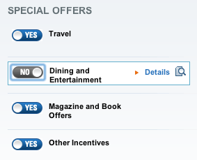
Switches may look nice, but did I unsubscribe? Or did I just sign up for more E-Mail?
- Yes, unsubscribe me!
- No, don’t unsubscribe me
- Yes, I want to receive marketing E-Mails
- No, I do not want to receive marketing E-Mails
As you can see, all four interpretations above make sense - user experience FAIL. I was probably not the only one with this problem, which is why elsewhere on the page, AMEX says:
You’re about to unsubscribe from e-mails regarding “Shopping”. You may also edit the rest of your marketing e-mail settings below by choosing “yes” [image] or “no” [image] for each category. To edit all of your communications from American Express, including Account Alerts, you must log into your Profile and Preferences.
Yeah, still confused.
Design less, not more
In The Role of the 21st Century Designer by Paul Scrivens aka @drawar, he talks about how we have to design less, not more. There’s enough noise out there already and we’re not doing anyone, especially our customers by adding to it.
So in conclusion, let’s look at a conventional unsubscribe page from O’Reilly.
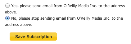
Loud and clear.
Edited on 6:29pm - updated images because I didn’t realize tumblr resized and cropped them. So I cropped them first.