Old Flow
- 1Homepage
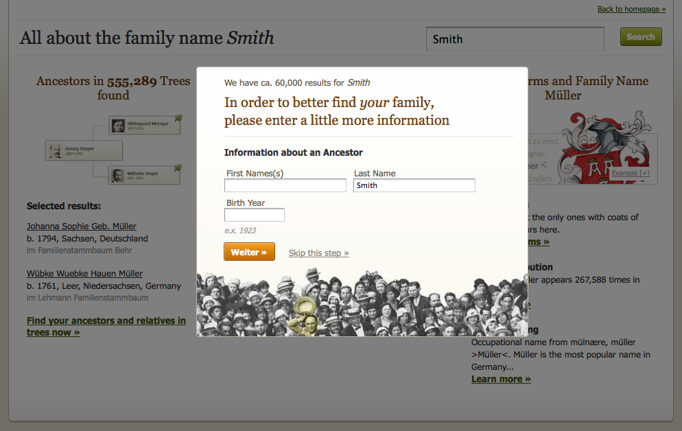
- 2Enter (full) name of ancestor
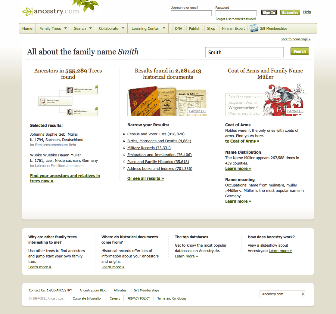
- 3Search Results Page
In 2010, I was asked by the country manager to analyze, conceptualize, suggest and design a new German user flow or onboarding experience. As a hybrid designer-developer, I was able to lead this UX project from research and conception to the final HTML/JS prototype.
What if we could increase new subscribers conversion rate by increasing number of steps in an onboarding workflow? Counterintuitive, but we tried anyway based on user research and improved our revenue.
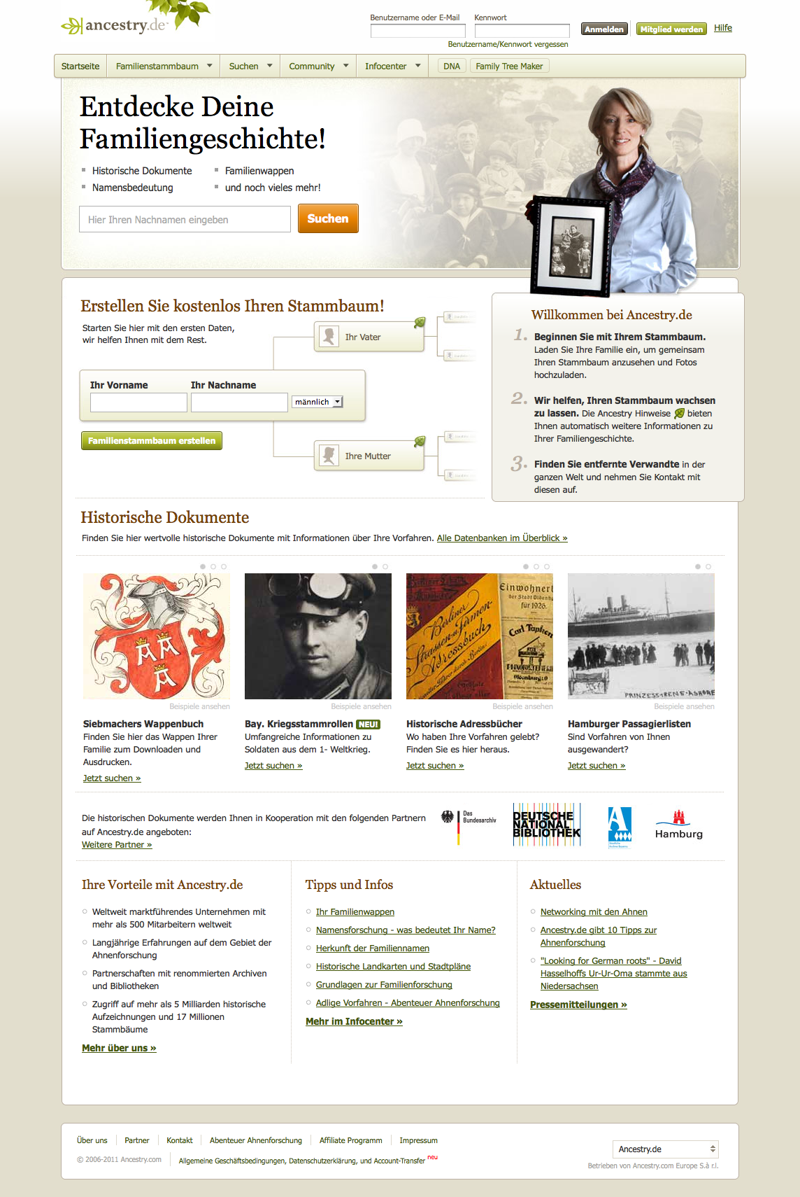
We wanted to tailor the German homepage to the German audience to increase conversion (registrations). At the time, most Ancestry.com properties asked users to immediately enter the name of an ancestor to perform a record search.
This approach did not work well with Germans. Why not?
As evidenced in the largely blurry Google Street Views, Germans are very concerned with privacy and personal information. Germans were not willing to provide identifying information like a full name.
Additionally many Germans were new to family history research. What if I didn't know the name of an ancestor? How could we provide these users with an easy win to get started?
We did not want to throw newbies into the deep end by immediately by showing a search results page.
The most important strategic change was to ease user into search results by inserting more steps. We start with just one thing: your last name. We ask for more information later if the user chooses to jump into historical documents.
Narketing required we we still include all information from the old page. So I created a page that was longer, but felt lighter. By using more whitespace, clear content division and typographical hierarchy, all information is presented in browsable and digetstible chunks. And large images.
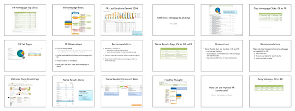
I spent about a month digging through Adobe Site Catalyst, analyzing where users were coming from, where they went, what they clicked, what they didn't etc. to make a recommendation on improving the flow.
We also knew:
This was one of the most interesting and fun projects I did while at Ancestry. I learned to substantiate my design decisions with data, not just intuition and anecdotal user interviews.
Because this was initially part of a large global effort, I had to go through several revisions that involved international stakeholders. This tested by patience but taught me to pitch.