2022
GitHub Action - Lowercase Linter
GitHub Action to drive file naming consistency for increased productivity across teams.
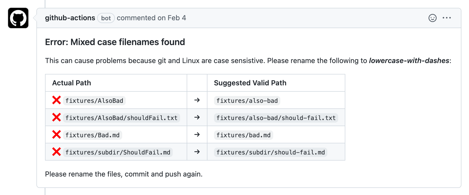
Challenge
Unix based systems and Windows treat file case sensitivity differently, which can lead to recurring git conflicts and broken deployments.
Solution
Create an GitHub Action to check for kebab-case consistency in filenames and break builds as needed, accelerating consistency and improving productivity.