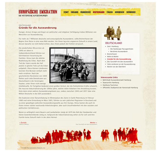
Informational Page with grunge feel
This microsite was created as apart of an acquisition effort through SEO channels.
Since this was to be an external website, I was given artistic freedom to style it however I wanted. I chose grunge because crossing the Atlantic in days and weeks aboard a ship really was often a harrowing business. Grunge may convey dirty and imperfection, but it is not dark and dreary. Here the reds and and yellows are akin to flames representation the passion and determination to leave ones own homeland in search of a brighter and better future.
As is evident in much of my other works. I like grunge but always believe in clear typographical hierarchy that is both easy to scan and read.
Design, Art Direction, HTML/CSS
Informational Page with grunge feel
Grunge style in detail
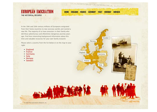
Start Page