Using web APIs as your CMS and redesigning Refresh Munich
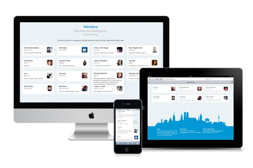
Last week Elias and I finally relaunched refreshmunich.com, the website for our user group of designers and developers in Munich. Because we are a web savvy bunch, we wanted to create a responsive website that would work on desktops, tablets as well as mobile phones using one set of markup and css.
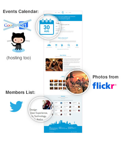
We also wanted to try to build a CMS-less site that we could still easily update via other services that we use regularly anyway, namely:
Github, Google Calendar, Twitter and Flickr.
Github allows you to host your repository's site on their servers via a special branch called "gh-pages". You are also allowed to host a single repository on a top level domain.
So when we discussed hosting, costs and shared user accounts on our private hosting plans, etc. using Github seemed to be perfect. We would have an account for the repository anyway.
Github (or Google Calendar) for events
Initially, Elias built calendar integration via Google Calendar. It seemed most logical. But time showed that we needed a bit more flexibility to include description, event type, location details, etc. If our location was "unconfirmed", we got google maps, errors, etc. So a compromise was to use a markdown gist on Github.
Member list via Twitter API (and responsive!)
Our members list has probably been the coolest features and most interesting to build.
For the relaunch, I wanted to use a responsive grid. Creating a responsive client side generated member's list has its challenges.
Working with live data
As designers, we tend to build pixel perfect mockups in Photoshop with at best sample data. Even when I account for edge cases, I find that more appear when using live data. So not only do you have to design your layout. You need to design your markup
Designing your markup
Firstly, because our markup is generated, I moved it from the JS file to my HTML file as a JS template like this (click to view on Github, lines 231-250):
This makes it much easier to adjust markup as needed. It is also a better separation of code.
What broke? Some users had no bio. This was most apparent on mobile in the one column version when the photo pushed into top of next person's "member card".
Conversely, some users had too much bio. In this case, I only had two levels of z-index for showing full bio on hover. At some point I had conflict with z-indexes of other members so I gave the member__card a higher index of 3 on hover.
But do I need really that higher z-index? Or so that extra wrapper <div>?
Commit more often
Honestly? I don't remember. I wish I had committed my code much more often when I was rebuilding the markup. Then I would know exactly I have that extra p. The comments tell me it is because of vertical padding required, which doesn't work for when using box-model box-sizing. But I'm not sure. Giant commits like this one don't tell me much.
I documented some logic in the LESS with comments. But looking back on it only a month after I wrote it, I wish I had the code changes to go with them.
Other lessons learned
- CSS: Cannot animate to height: auto So the member list just has a simple hover. But probably better UX wise anyway since an animation slows reading time.
- APIs: What about Flickr? Flickr has one of the worse APIs ever. We found it difficult to use and never managed to load photos from a public pool. Instead we have to manually add photos to our own stream.
- Icon web fonts: Pictos server is finickyPictos server doesn't work on IE and all platforms as advertised. Going forward I recommend using self-hosted web-fonts to avoid cross domain issues that plague IE, and maybe even Android. But the Pictos license is ambiguous about whether that is allowed and support non-responsive.
- Web fonts: gave up on IE I probably could have just picked a different font. But I got tired of trying to make Adelle sans look presentable in IE and just use a standard sans-serif font stack. So shoot me.
I had planned more front end markup and CSS content for this post but it's getting too long so that will have to wait. Until then, go to refreshmunich.com and resize the browser to your heart's content or review the code on github.


